


Most exhibitors approach 10×10 trade show displays with unrealistic expectations. They want brand impact, product storytelling, storage, lighting, and meeting space—inside 100 square feet. On paper, it sounds manageable. On the show floor, it rarely is.
Small booths punish poor planning faster than large ones. There’s no extra space to hide oversized hardware, no margin for cluttered graphics, and no forgiveness for inefficient layouts. Every inch matters, and every decision compounds.
This is why 10×10 trade show displays demand more discipline, not more features. Success isn’t about cramming everything in—it’s about choosing the few elements that actually work under real show conditions.
Physical Limitations of a 10×10 Booth
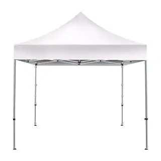
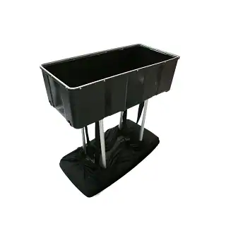
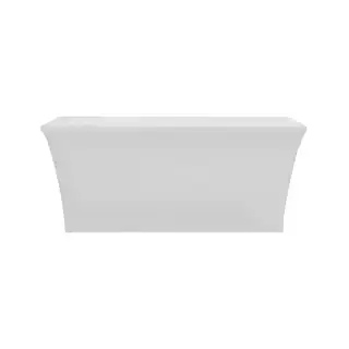
The first constraint is floor space. Ten feet by ten feet fills up quickly once staff, displays, and personal items are added. A single table can consume a quarter of the booth, and poor staff positioning can block traffic entirely.
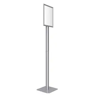
Height regulations are the next limiter. Most shows cap 10×10 booths at around 8 feet. Displays that rely on vertical dominance, towers, or hanging signage often run into compliance issues.
Sightlines are the hidden challenge. Attendees see small booths briefly and from sharp angles while walking aisles. Displays must communicate instantly and still look clean up close.
The best 10×10 displays respect these physical realities instead of fighting them.
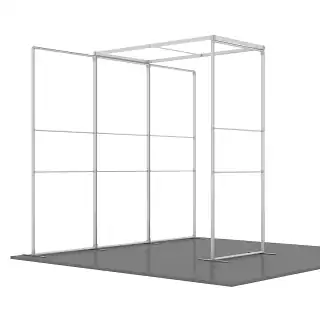
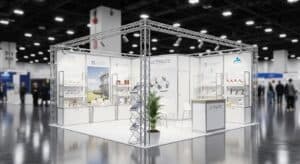
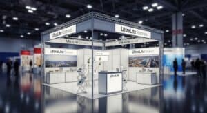
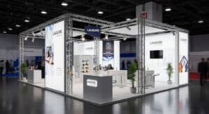
Display Structures That Actually Fit and Function
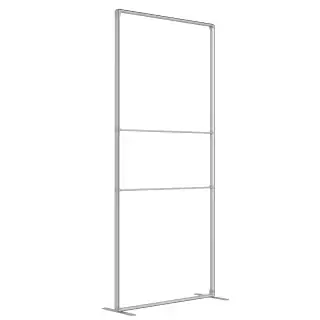
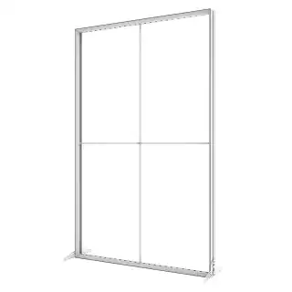
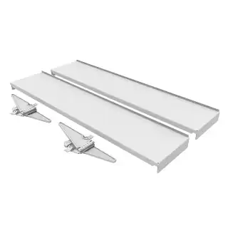
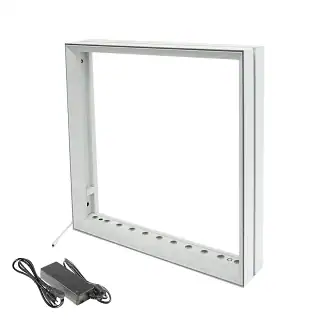
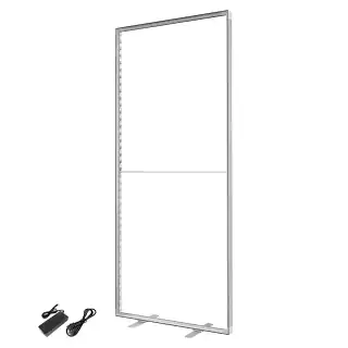
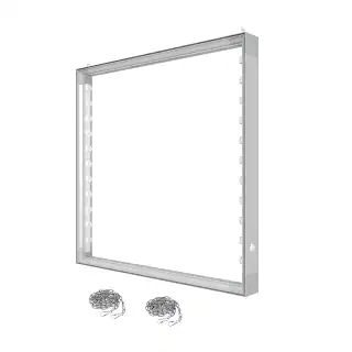
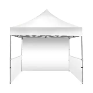
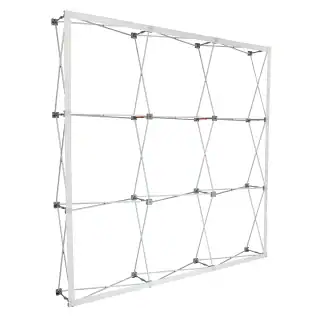
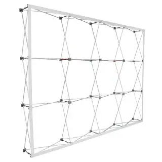
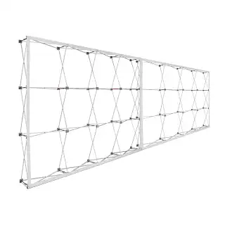
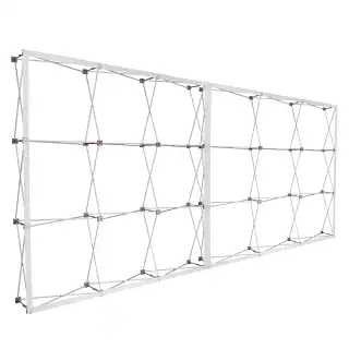
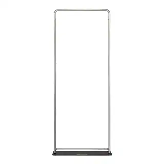
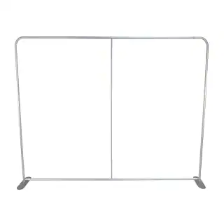
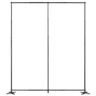
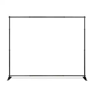
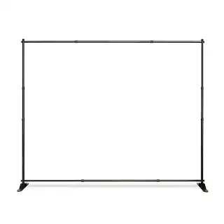
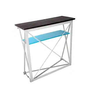
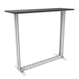
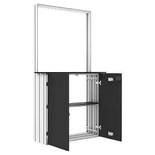
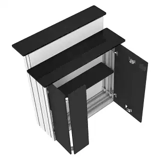
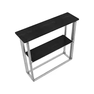
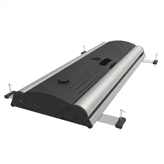
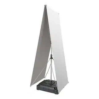
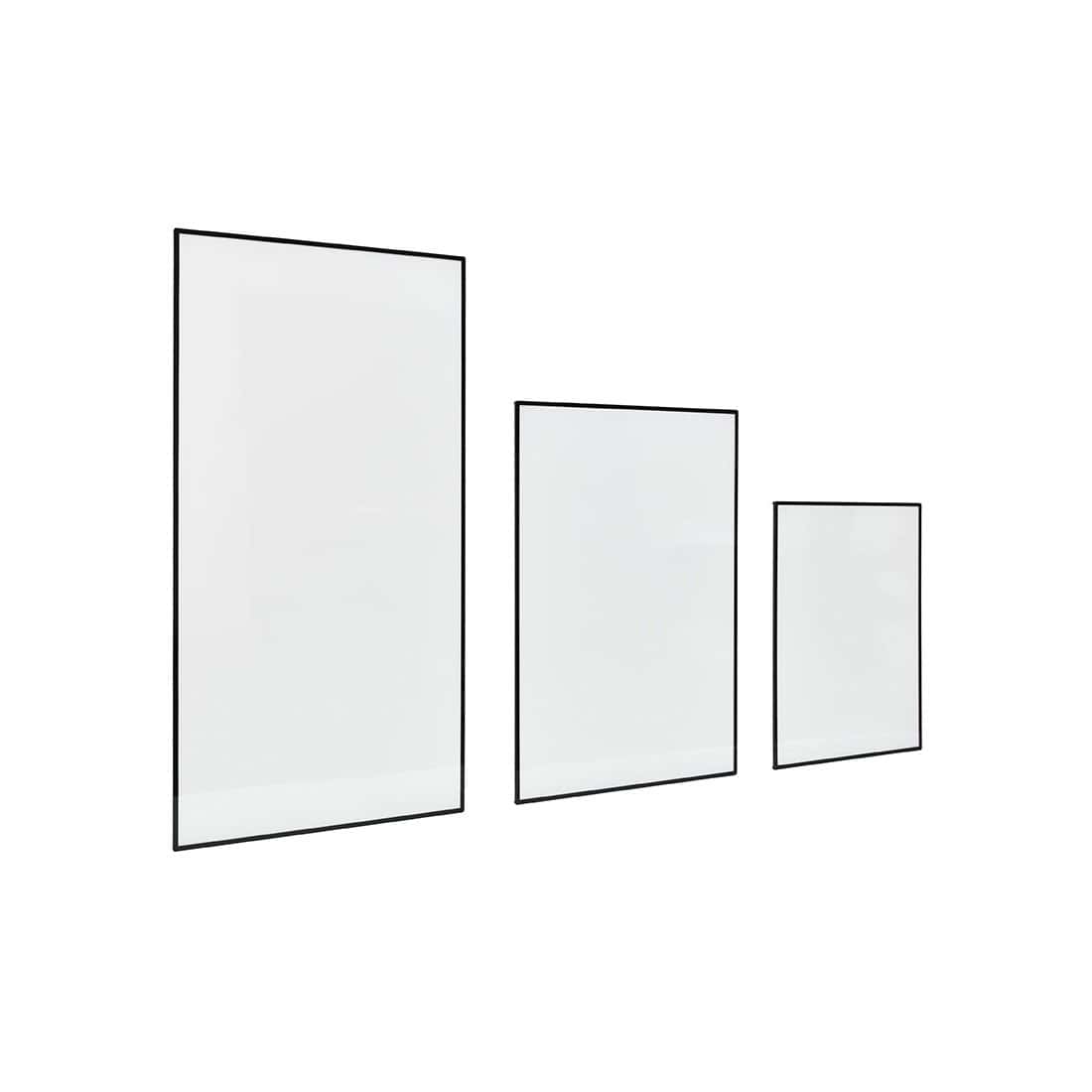
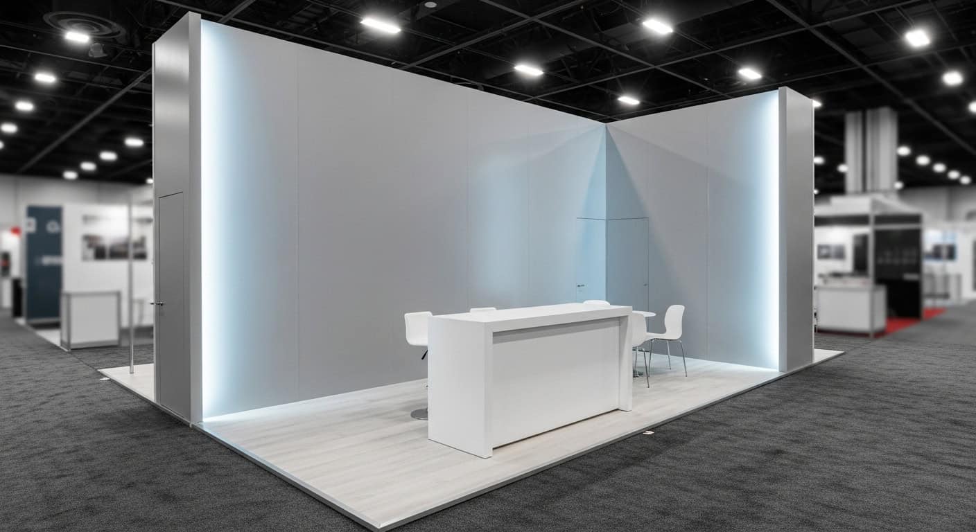
In a 10×10 booth, the back wall does most of the work. A single, well-designed back wall establishes brand presence without consuming valuable floor space.
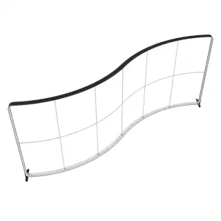
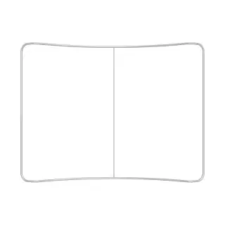
Straight walls consistently outperform curved walls in small booths. They preserve usable space, simplify graphics, and reduce installation complexity.
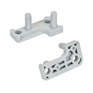
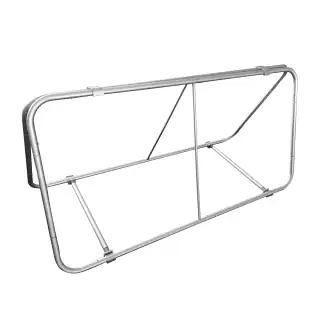
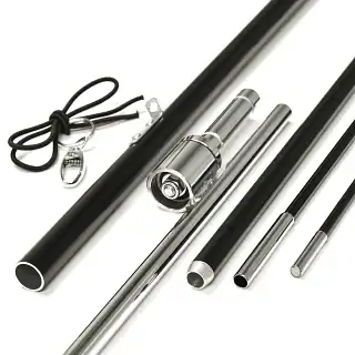
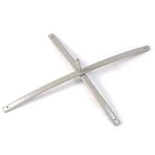
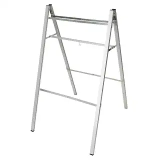
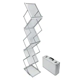
Modular frames are critical. Systems that break into manageable sections are easier to ship, repair, and adapt across different venues. Fixed, one-piece structures often become long-term liabilities.
Lightweight systems win almost every time. Aluminum frames, fabric graphics, and tool-less assembly reduce setup time and labor stress.
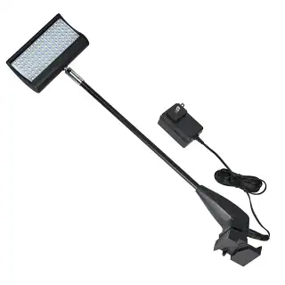
Backlit vs Non-Lit Displays in Small Booths
Backlit displays can be powerful—but they are not automatic wins in 10×10 spaces.
The advantage is visibility. Even subtle illumination draws attention in crowded halls, and a single backlit wall often outperforms multiple non-lit panels.
The trade-offs are power access and cost. Electrical drops are not always convenient or inexpensive, and poor planning can leave a booth underpowered.
Backlighting works best with simple, high-contrast graphics. Complex messaging rarely benefits and can become harder to read when illuminated.
Graphic Design Considerations for Close Viewing
Most 10×10 graphics fail because they try to say too much. In close-view environments, message hierarchy matters more than visual effects.
Primary messaging should be readable in two seconds or less. A headline, a short supporting line, and one strong visual usually outperform dense layouts.
Small text, crowded bullet lists, and busy backgrounds become liabilities at three to five feet.
White space is not wasted—it’s functional. The best-performing small booths feel calm and intentional, not cluttered.
Transport, Setup, and Storage Realities
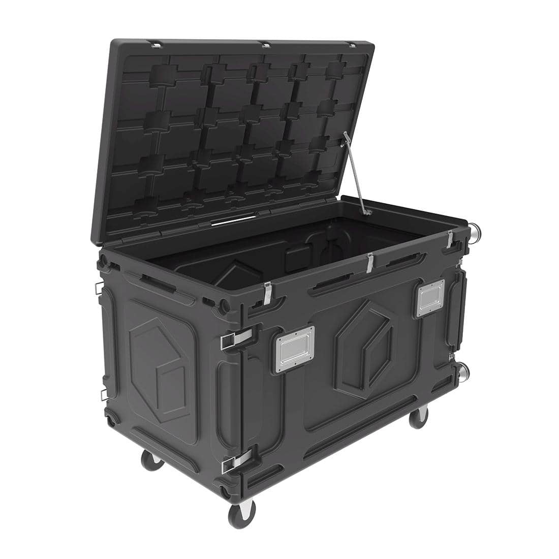
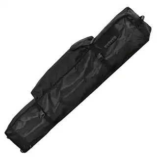
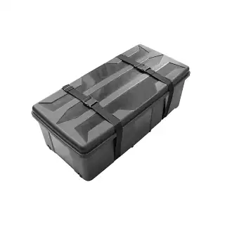
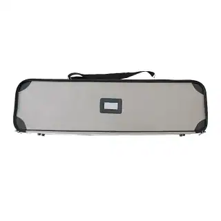
Logistics often determine whether a display is a success long-term. Oversized or overweight cases trigger freight charges and handling issues.
The best 10×10 trade show displays pack into one or two manageable cases that one person can move without special equipment.
Setup time matters. Displays that take too long to assemble become stressful during rushed move-ins. Tool-less systems consistently reduce errors and fatigue.
Storage affects longevity. Displays that break down cleanly last longer than those that require forcing parts into cases.
Common Mistakes Exhibitors Make
Overloading the booth is the most common mistake. Too many elements compete for attention and reduce impact.
Ignoring lighting is another. Even non-lit displays benefit from thoughtful spotlight placement.
Poor layout planning—blocked entrances, front-loaded tables, staff standing in traffic paths—immediately reduces engagement.
These are planning failures, not creative ones.
How to Plan a Display for Multiple Events
Experienced exhibitors plan for reuse from the beginning. Modular structures allow components to be reconfigured rather than replaced.
Graphic swaps extend lifespan and reduce costs. Frames designed for easy updates support evolving messaging.
A slightly higher upfront investment often pays off over multiple shows through reduced reprints, lower labor costs, and fewer replacements.
The goal is not a perfect booth for one show—it’s a reliable system for many.


 5101 Commerce Dr., Baldwin Park, CA 91706
 ExhibitorLive 2026 , Mar 30-April 1, Tampa , FL , Booth #237