

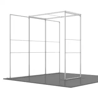
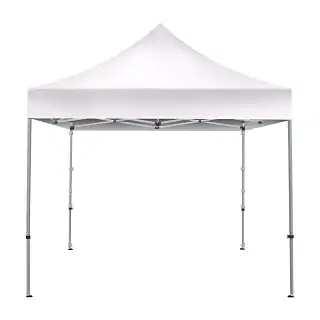
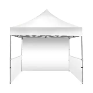
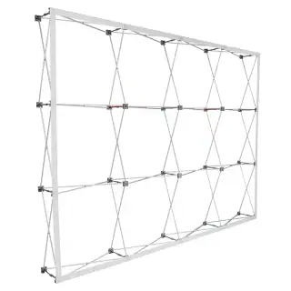
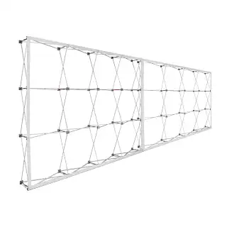
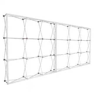


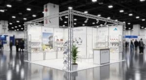
A 10×30 Trade Show Booth gives you 300 square feet of opportunity — or 300 square feet of wasted potential. The difference comes down to layout strategy, vertical dominance, and traffic psychology.
Most brands treat a 10×30 like an extended 10×20. That’s a mistake. Depth changes behavior. It changes flow. It changes how attendees engage with your message.
Why the 10×30 Footprint Is Strategically Powerful
A 30-foot-wide booth gives you triple the frontage of a 10×10. That means increased sightline exposure, stronger branding repetition, and greater control over how traffic enters and moves.
But width without structure creates clutter. The key is intentional zoning.
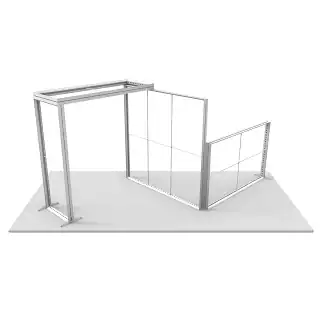
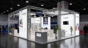
1. Divide the Space Into Functional Zones
- Front 10 feet: Attraction and interruption
- Middle 10 feet: Product education and demos
- Rear 10 feet: Sales conversations and lead capture
This structure prevents the “bowling alley” effect and keeps engagement progressing forward.
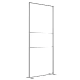
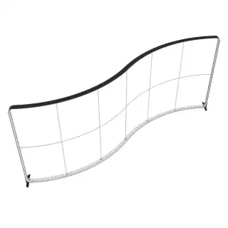
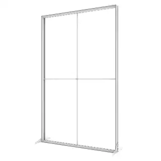
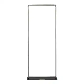
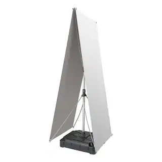
2. Maximize Vertical Real Estate
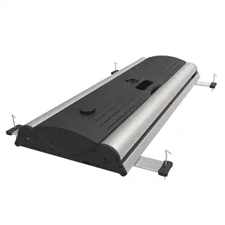
In a crowded exhibit hall, height equals visibility. Use tall backwalls, layered lighting, and suspended signage where allowed. Flat designs disappear at 40 feet. Vertical structure commands attention.
3. Control Traffic Flow Intentionally
A straight corridor layout creates a tunnel. Instead, use angled elements, open corners, and partial partitions to guide movement diagonally. Diagonal flow increases dwell time and interaction probability.
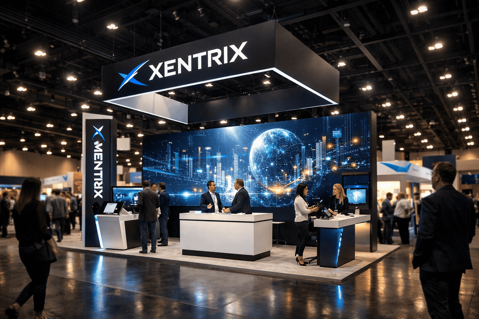
4. Establish One Dominant Visual Anchor
One message. One hero product. One LED wall. Too many focal points dilute authority. A single hard anchor creates memory retention and improves brand recall after the show.
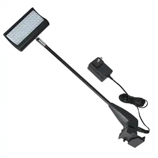
5. Layer Lighting Strategically
- Ambient lighting for overall tone
- Accent lighting to highlight products
- Task lighting for demo clarity
Exhibit hall lighting is flat and harsh. If you don’t control your own lighting hierarchy, your booth will look washed out.
6. Separate Attraction From Conversion
Not everyone who steps inside is ready to talk pricing. Use spatial depth to qualify interest. Front engagement areas should be high-energy and open. Rear areas should feel semi-private and focused.
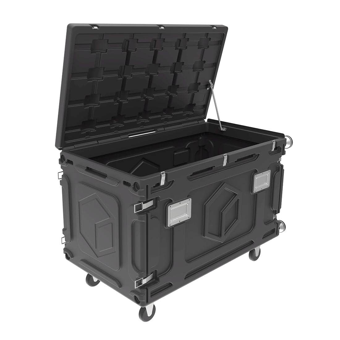
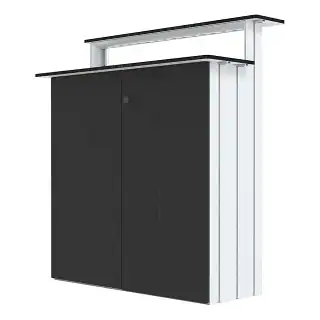
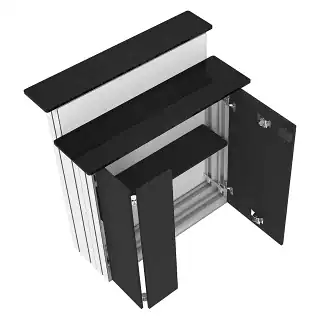
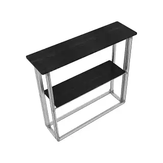
7. Integrate Smart Storage
Clutter kills credibility. Build storage into backwalls or side panels. Staff bags, extra literature, and personal items should never be visible from the aisle.
8. Design for Long-Distance Legibility
If your headline can’t be read from 20 feet away, it’s ineffective. Prioritize message hierarchy:
- Primary value statement
- Supporting proof
- Brand identity
Complex messaging reduces scan speed. Keep it tight.
9. Build for Reusability
Modular panel systems allow reconfiguration for different show sizes. A well-designed 10×30 can scale down to 10×20 without losing structural integrity. That protects budget long-term.
10. Measure Performance Like a Marketing Asset
Success is not “we had good traffic.” Track measurable KPIs:
- Qualified leads captured
- Demo participation rate
- Average engagement time
- Post-show conversion rate
A booth is a performance asset, not a decoration.
Final Reality Check
A high-impact 10×30 Trade Show Booth is not about filling space. It’s about controlling attention, guiding behavior, and engineering conversion zones.
If your layout doesn’t intentionally move attendees from awareness to conversation, you’re paying for square footage — not results.


 5101 Commerce Dr., Baldwin Park, CA 91706
 ExhibitorLive 2026 , Mar 30-April 1, Tampa , FL , Booth #237