

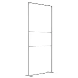
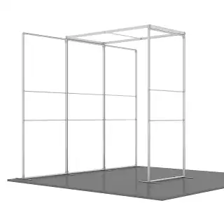
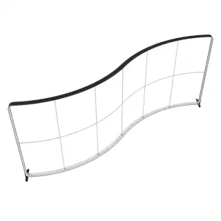
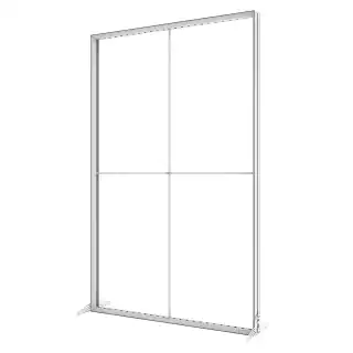
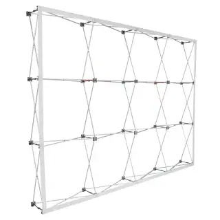
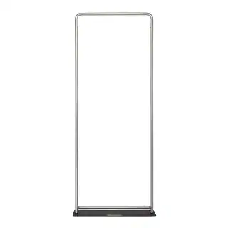
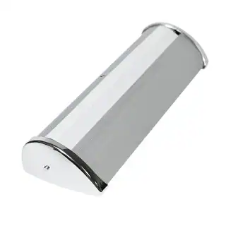
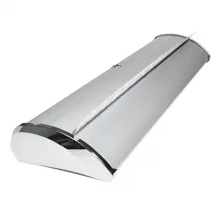
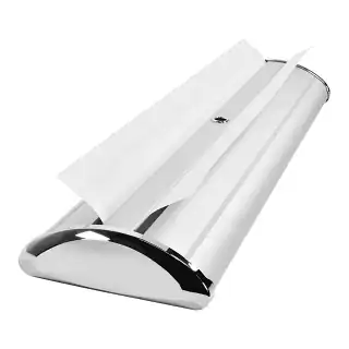
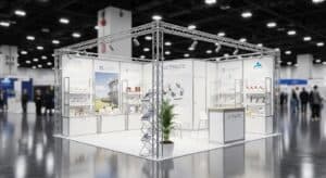
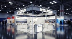
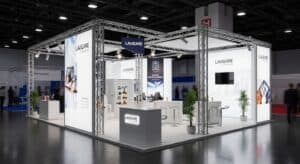
1. Understanding the 4×6 Canvas: Spatial Hierarchy
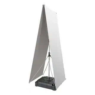
The first step in effective design is understanding the “human-scale” nature of the 4×6 footprint. Because this display is often mounted at eye level, the viewer’s interaction is personal and immediate.
The “One-Second” Rule
In a busy environment, you have roughly one second to capture a viewer’s attention. For tension fabric frames, you must establish a clear visual hierarchy:
- The Hero Element: Choose one dominant visual—a high-resolution product shot or a massive headline. This should occupy at least 50–60% of the canvas.
- Secondary Information: Support the Hero with a concise sub-headline or a clear call to action (CTA).
- Whitespace: Clean margins make the seg wall look like an intentional piece of architecture rather than a cluttered advertisement.
2. Typography: Authority and Legibility
Typography on seg fabric frames needs to be bold. Because the fabric is pulled drum-tight, the surface is perfectly flat, allowing for razor-sharp text edges—if the file setup is correct.
Scale and Proportion
- Headlines: For a 4×6 vertical panel, headlines should be at least 4 to 6 inches tall for readability from 15–20 feet away.
- Body Copy: Keep body text to a minimum. Ensure it is no smaller than 1 inch (72pt) to maintain legibility for those standing 3 to 5 feet away.
Font Selection
Sans-serif fonts like Helvetica, Montserrat, and Futura are the gold standard for silicone edge graphics printing. Their consistent stroke weights translate beautifully to the weave of the polyester fabric. Avoid extremely delicate serif fonts, as they can sometimes be “swallowed” by the texture of the fabric during the heat-transfer process.
3. Imagery: The 100-DPI Standard
Perhaps the most common mistake in large-format design is using low-resolution imagery. In a lobby seg wall display, the viewer is often standing within arm’s reach.
- The Golden Rule: Your final file must be 100–150 DPI at full physical size (48″ x 72″).
- The Artifact Trap: Avoid “pulling” images from websites. Even if they look acceptable on a laptop, they will appear pixelated when blown up to 6 feet tall.
- Vector Assets: Whenever possible, use vector-based illustrations (.AI or .EPS) for logos and icons to ensure infinite scalability.
4. Color Science and Dye-Sublimation
Silicone edge graphics printing typically utilizes dye-sublimation, where ink is fused directly into the polyester fibers. This creates a vibrant, “built-in” color look much richer than traditional surface printing.
The Power of Contrast
Because fabric absorbs light rather than reflecting it (unlike glossy vinyl), you can play with high-contrast color palettes. For deep, velvety blacks, use a “Rich Black” formula like C:60 M:40 Y:40 K:100. This ensures the black looks deep and expensive under office lighting.
Designing for Backlighting
If you are using a backlit silicone edge graphics frame, increase the contrast of your design by 10–15%. Light passing through the fabric tends to “wash out” mid-tones; pushing your shadows deeper maintains a “3D” effect when the LEDs are turned on.
5. Logo Placement and “Safe Zones”
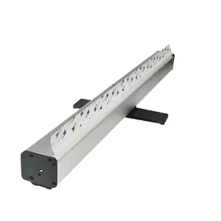
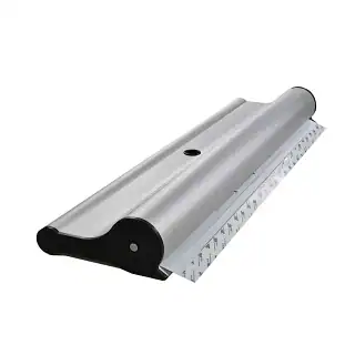
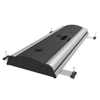
In a 4×6 seg wall, the “Safe Zone” is critical. Because the edge of the fabric is sewn with a silicone gasket (keder) and tucked into an aluminum channel, elements placed too close to the edge risk being partially obscured.
- The 2-Inch Margin: Keep all critical elements—logos, QR codes, and fine text—at least 2 inches (50mm) away from the final trim line.
- The Corner Pinch: Tension is highest at the corners. Centering your logos or providing generous padding prevents a “pinched” or distorted look.
6. Practical Checklist for a Flawless Design
Before sending your file to the printer, ensure these technical specs are met:
- Document Setup: Set artboard to 48″ x 72″ (or 1/10th scale at 1200 DPI).
- Color Mode: Always work in CMYK. RGB colors will shift significantly during the heat-transfer process.
- Bleed: Add at least 1/2 inch of bleed to all sides to account for the fabric wrap.
- Outlines: Convert all fonts to “Outlines” to prevent font substitution errors.


 5101 Commerce Dr., Baldwin Park, CA 91706
 ExhibitorLive 2026 , Mar 30-April 1, Tampa , FL , Booth #237