

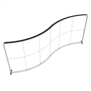
1. The Science of Viewing Distance
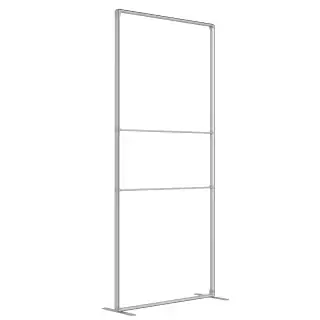
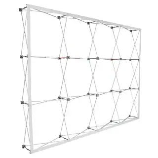
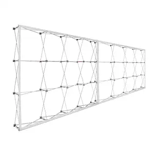
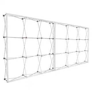
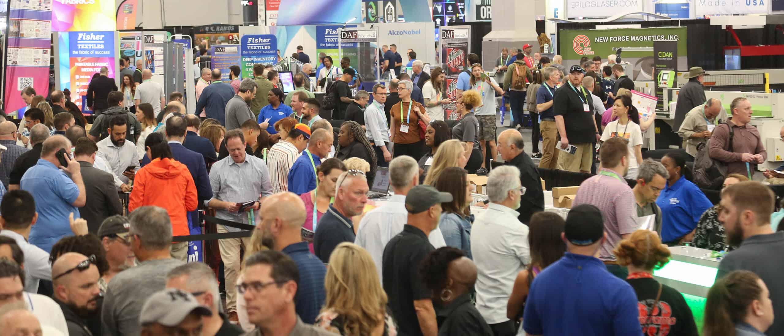
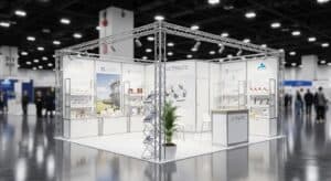
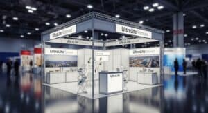
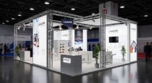
One of the most common mistakes in large-format design is failing to account for the physical proximity of the audience. A 7×7 panel is an “intimate” mural; unlike a billboard viewed from a highway, this display is often placed in lobbies or trade show booths where viewers stand only a few feet away.
- The “Close-Up” Reality: Because viewers stand within arm’s reach, your resolution must be impeccable. We recommend a minimum of 100–150 DPI at full physical size. Anything less results in visible pixelation that detracts from a premium brand image.
- The 10-Foot Rule: Your primary “hook” must be identifiable within 3 seconds from 15 feet away. Use the massive square scale to feature one dominant “Hero” visual element rather than a cluttered collage of small images.
[Image: Graphic resolution comparison showing pixelation vs. high-DPI crispness on fabric]
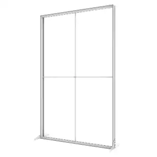
2. Typography and Layout for 7-Foot Walls
Typography on a 7-foot square requires a balance of bold authority and refined legibility. High-tension fabric creates a perfectly flat surface, which is ideal for crisp text, but the layout must respect the boundaries of the aluminum channel.
Hierarchy and Scale
For a 7×7 space, primary headlines should typically be between 300pt and 500pt. Sans-serif fonts generally provide the most modern, readable look at this scale.
Safety Zones & Margins
Keep critical text and logos at least 2 inches away from the edge. This “Safe Zone” ensures that no part of your branding gets tucked into the recessed aluminum channel or sits too close to the corner “pinch points” where the fabric tension is highest.
Pro Tip: Avoid placing logos in extreme corners. This often looks “pinched” and risks the logo being partially obscured by the frame’s tension pull.
3. Optimizing Color & Lighting for Textile
Dye-sublimation printing “fuses” ink into the fibers, creating rich results that differ significantly from a backlit computer screen or standard vinyl.
The “Rich Black” Secret
Fabric naturally absorbs light. To prevent a “washed out” or charcoal-gray appearance in your design, use a Rich Black formula. Our prepress technicians recommend C:60 M:40 Y:40 K:100 for maximum depth on polyester fibers.
Designing for Backlighting
If you are using a Backlit Impression Panel, push the contrast of your photography. High-contrast imagery creates a “3D” effect when lit from behind. Avoid large areas of flat, pale gray, as these can appear “muddy” or “noisy” when illuminated by internal LEDs.
4. Technical File Prep: The Bridge to Quality
Fabric stretches and shrinks slightly during the high-heat printing process, making specific file setup vital for a professional finish.
- Vector vs. Raster: Always keep logos and typography in Vector format (AI or PDF) for infinite scalability. For photos, use high-resolution TIFF files to avoid compression artifacts.
- The 1/10th Scale Trick: Working on a full 84″ x 84″ file at high resolution can lag your hardware. Design at 1/10th scale (8.4″ x 8.4″) at 1200 DPI. When scaled up 1000% by the printer, you get a perfect 120 DPI output with a manageable file size.
- Color Profiles: Convert files to a standardized CMYK profile like GRACoL2006 to prevent unexpected color shifts during the heat-transfer process.
5. Common Pitfalls to Avoid
- Too Much Fine Print: If a viewer has to lean in to read it, the 7×7 scale is wasted. Treat the panel as a focal point, not a brochure.
- Ignoring the Pull Tab: Most SEG graphics have a small tab for easy removal. Ensure your design doesn’t place a critical QR code exactly where that tab sits.
- Overcrowding: On a 7×7 panel, don’t feel the need to fill every inch. Whitespace (or “empty” space) creates a gallery effect that makes your brand appear more luxury.


 5101 Commerce Dr., Baldwin Park, CA 91706
 ExhibitorLive 2026 , Mar 30-April 1, Tampa , FL , Booth #237